How lighting impacts modern condo design in mexico

As you probably have noticed by now, I like to report on the lighting I experience when visiting other countries. This time it is Puerto Vallarta, Mexico. The city has massively built-up since the last time I was there 10 years ago.
The old part of town is still funky, fun and fabulous. As you are leaving the more historic area and drive out towards the airport, you can see that there is a lot of construction going on. So many new high-rise condominiums.
In 2015 we stayed in condominium, located on the hillside above the beach in the old part of Puerto Vallarta. Everything was made of concrete, even the beds. They were definitely not movable. The construction had a hand hued feel to it. It was charming.
This time, we went to look at a model home which was going to be part of three unit high-rise condominium complex near to where the cruise ships come in, just on the outskirts of downtown Puerto Vallarta.
Construction wasn’t even going to start until next year, so there was a free standing condo model that prospective buyer were able to tour. They even have drone images of what you would see from the different floors, 16 altogether.
It was surprisingly European in feel. The finishes were very crisp and modern, as were the furnishings and lighting. It was gratifying to see how much attention had been paid to the light fixtures, both architectural and decorative.
Even though it was daytime when we did the walk-through the lighting read well. I think that it helped it that it was an overcast day. The recessed LED fixtures were not overused which is often the case in the US condo market, They were using the warm-dim technology, so that the color temperature could go from 4000° Kelvin to 2200° Kelvin.
We also noticed that there was a reveal in the ceiling above the sliding glass doors that led from the balcony to the living room/dining room. This is space made for the shades, which also housed a linear LED that could wash the window coverings with light at night. A very thoughtful detail.
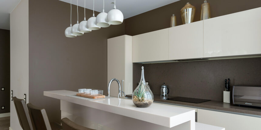
The kitchen was well-designed with pendant fixtures over the island, some recessed lighting and linear lighting below the upper cabinets. There was also lighting inside the cabinetry, which was also a really appreciated feature.
The primary bathroom had two sinks with individual lighting, using backlit mirrors. These two also had the warm-dim technology. This is great for when you are putting together an outfit or putting on make-up for day or night.
There was a large scale, single mirror in the second bedroom bath. Pay no attention to my hand and the reflection.
It really made the room feel larger. I always liked having even illumination on my face at the mirror. I was also pleased to see that there was not a recess down over the sinks. All this does is cause hard shadows on people’s faces, which ages them visually. This is no way to start off your day.
It was interesting to see the pendant fixtures over the side tables in the primary bedroom. This gave the smallish side tables more room for other items. This room also had the ceiling reveal to house the shade material and linear lighting.
They did make use of floor lamps and table lamps throughout, which I feel is an important part of a successful lighting design. It’s so much better than just a room filled with recessed downlights. Its all about light layering, combining task, accent, ambient and decorative lighting to create a welcoming and cohesive design.
A few suggestions I made were to offer potential buyers the choice of putting in recessed adjustable fixtures instead of fixed downlights, so that they could be directed towards art and table tops. The other suggestion I made was to install some toe-kick lighting below the floating sink consoles, activated by a motion sensor, so that in the middle of the night people could navigate the bathroom without having to turn on an overabundance of illumination.
Via: https://www.furniturelightingdecor.com/


